

Teaching the letter fonts
Teaching routes
The Teach Handwriting Scheme and website teaches the capital letters together with your choice of the three main lower-case font styles taught in UK schools: print, cursive and continuous cursive.
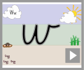
- Print - These letters never join and have a range of starting and finishing points.
- Cursive - These letters have the same starting points as print but with the exit strokes included.
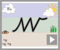
- Continuous Cursive - These letters all incorporate entry and exit joining strokes, have the same starting point and the majority have the same finishing point.
You can choose from the following teaching routes:
Teaching Route A
To first teach the print font style; next the single letter cursive font style; then the joining letter entry strokes; finally joining the letters.
Teaching Route B
To first teach the print font style; then the single letter continuous cursive font style; finally joining the letters.
Teaching Route C
To first teach a single letter cursive font style; next the entry stokes for joining letters; then joining the letters.
Teaching Route D
To teach a single continuous cursive font style; then joining the letters.
Letter versions
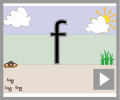
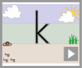
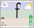
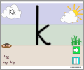
We offer 2 types of print font, our original "ball and stick" and a new modern "UK Phonics friendly" one.
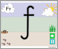
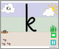
As the letters f and k, in our "UK Phonics Friendly" print font, can be written in different ways, impacting on which letter family they are taught in, we offer you 4 letter combination choices (Versions 2, 3, 4 and 5).
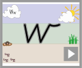
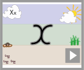
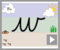
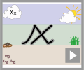
The Teach Handwriting Scheme and website teaches most of the letters within our cursive and continuous cursive font as a standard style, however, we do offer two letter versions for the letters w, x and z. The letter version chosen dictates which letter family (teaching groups) they belong in. This is why we have the letter versions 1, 2, 3 and 4. In each letter version all the letter and worksheets are in the appropriate letter families.
Which to teach first - capital or lower-case letters?
The view here at Teach Children is to focus on lower-case letters first;
Why?
- One reason being that about 95% of what children write, and are exposed to, is in a lower-case form and only 5% in capital.
- Lower-case letters are far less complicated, requiring fewer pencil lifts to complete them.
- As both lower-case and capital letters require a child to form curved lines, a skill which most children have to practise, writing lower-case letters is no more difficult than writing capitals.
- In a young child’s writing all the letters are initially the same size, whether they are capitals or lower-case letters; it is part of the normal developmental path of handwriting. So the view that teaching capitals letters is easier because they are bigger is not true.
- Young children who have learnt mostly capital letters first find it difficult to stop, as it is so ingrained into the memory, often using them half way through words and sentences. Even when they are older this inappropriate use of capitals creeps back into their work especially if they are tired or concentrating hard on composing their work.
A child’s first major achievement, in their eyes, is to write their name. So, although concentrating on lower-case letters, teach them how to form the capital letter of their name to get them excited about handwriting.
As they master the lower-case letters introduce the remainder of the capital letters. It is important that both are taught so that a child can develop a speedy, fluid and legible handwriting style.
The four most popular handwriting font styles taught in UK schools
It is important that parents know which letter font and style their child’s school is teaching. This will ensure that children will not get conflicting messages between home and school on how to form letters correctly.
There are four main font styles taught in UK schools; manuscript capital letters, print, cursive and continuous cursive.
A more traditional approach to teaching handwriting is first teaching the print font style, then moving to a single letter cursive font style (which has the same letter start points as print) and finally introducing the join stokes for joining letters (this is our Teaching Route A option).
Some schools will teach print then a continuous cursive font style (this is our Teaching Route B option). This means learning a new set of more consistent start and finish points when forming the single letters, however, it does make learning to join far easier as the exit and entry strokes to join have already been learnt and the letters only need to be written closer together.
Other schools will teach cursive from the beginning (this is our Teaching Route C option) and then introduce the join strokes for joining letters.
While others teach continuous cursive straight away so the children only learn one font style and learning to join is far easier (this is our Teaching Route D option).
The difference between Cursive and Continuous Cursive handwriting fonts
Many people think that Cursive is just short for Continuous Cursive. In fact they are two different handwriting fonts.
Cursive:
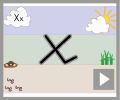
- The letters start at different points (like the print font).
- The finishing points for all the letters is the writing line; except for o, r, v and w which have a top exit stroke.
- The single letter formations are taught with just the exit strokes.
Continuous Cursive:
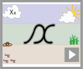
- The starting point for all the letters is the same; on the writing line.
- The finishing points for all the letters is also at the writing line; except for o, r, v and w which have a top exit stroke.
- The single letter formations are taught with the entry and exit strokes, this makes the transition from single letter formation to joined handwriting very straightforward and allows it to occur sooner.
Letter Families and Letter Versions
Letters are created through joining lines and curve shapes in a particular way. They have a designated start point and set directional pushes and pulls of the pencil to reach the designated finish point. This is why at Teach Children we teach letter formation in groups/families rather than in alphabetical order. Certain groups use the same, or similar, shape and directional pushes and pulls of the pencil to form the letter, for instance the letter c has the same start point and anti-clockwise directional movement shape that is needed to create the letters a, d, g, o and, although a little more complicated, the letters s and e. Teaching letters in groups or families can also help to limit letter reversals such as b and d. Also by teaching letter groups in certain orders enables children to write whole words, which have meaning to them, and this in turn encourages them to write more.
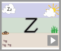
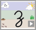
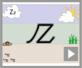
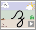
Some letters can be written in different ways using the same font style (cursive or continuous cursive), for example the letter ‘z’. Both are acceptable, however, they would appear in different letter families. The first ‘z’ would be part of the Straight Lines family while the second would be part of the Hooks, Loops & Lines family.
The advantages of the different handwriting fonts
All schools have to teach children how to form capital (upper-case) letters. Capital (upper-case) letters and lower-case print letters never join to other letters.
Why people like to teach Print:
- Similar to print found in young children’s books and the environment around them.
- Most adults can write using print.
- Print is used later as an un-joined style for labelling diagrams or data, in maths and science or for filling in forms.
Why people like to teach Cursive:
- Cursive single letters have the same start points as print but with the exit strokes included.
- Only need to teach entry stokes for joining letters.
- All the letters can be joined; depending on the letter versions selected.
- Words are written in one set of movements without the pen being taken off the paper, this helps the motor memory to store spellings. This is especially important for those irregular spellings which so many children find hard to commit to memory.
- The result is easy to read, good to look at and quick to produce.
Why people like to teach Continuous Cursive:
- The starting and finishing points for all the letters are easier to remember (they all start on the line and, other than a few exceptions - o, r, v & w - all finish on the line).
- It can limit letter reversal issues, such as b & d.
- The child only has to learn one style of writing rather than print and then 2 years later cursive for joining.
- The transition to joined writing is simple and occurs sooner.
- It helps the flow of the writing as the letters naturally provide a left to right directional movement. This rhythmical flow also aids speed and fluency.
- There is a clear distinction between upper and lower-case letters.
- Many children with specific learning difficulties find the continuous cursive font style easier to learn and it is often recommended by specialist teachers, educational psychologists and is used in dyslexic friendly schools.
- Words are written in one set of movements, without the pen being taken off the paper, which helps the motor memory to store spellings. This is especially important for those irregular spellings which so many children find hard to commit to memory.
- Due to the early stage at which children can join and write with pace, they have found that children concentrate more on the composition of the writing, because they do not have to think about how to form the letters.
- Some teachers feel that teaching print firsts helps young children to read, at present all evidence suggest this is not the case as handwriting and reading are different skill sets. However, handwriting is linked to supporting a child in developing their letter recognition, which is further supported via exposure to a wide range of font styles. This letter recognition is vital in learning to read.
- The result is easy to read, good to look at and quick to produce.